DA architects and Ricardo Alves have teamed up to create the offices of a pharmaceutical company
located in Sofia, Bulgaria. It embodies the core elements of office design trends in the post-epidemic
era: comfort and efficiency.
The biggest feature of the new collaborative office space is that it needs to find a balance between
work and leisure to ensure that users can freely switch between different scenes and obtain the
best experience.
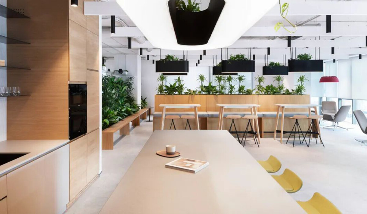
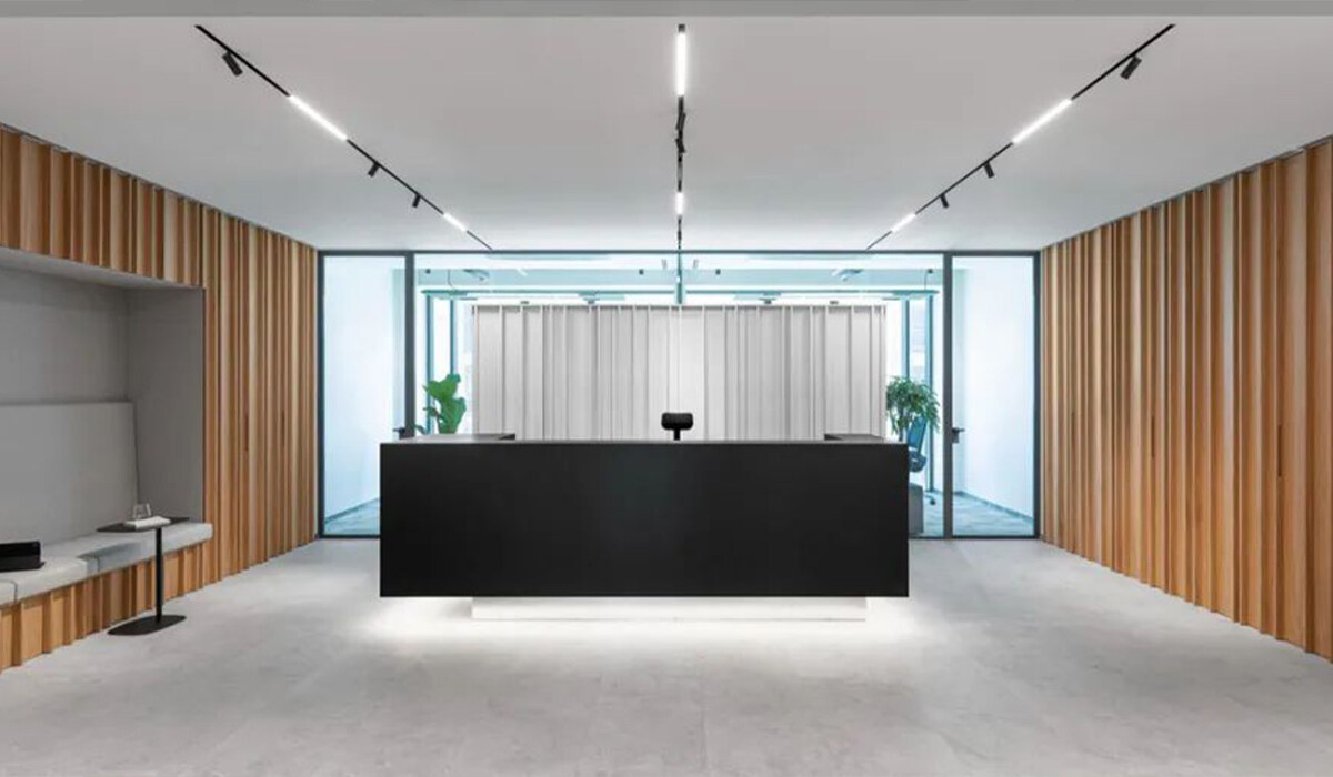
More and more scenes created by "unconventional" designs are appearing in people's field of vision,
which not only satisfy the function, but also take into account the beauty of space. In addition to the
spatial perception and order visible to the naked eye, collaboration has been interspersed in various
spaces, and can be fully and frequently used.
The spatial presentation pursues fluid transition, that is, a gentle transition in penetration function
between different areas, allowing the use of a certain space to expand to other areas, and the mutual
penetration and integration blurs the boundaries between them.
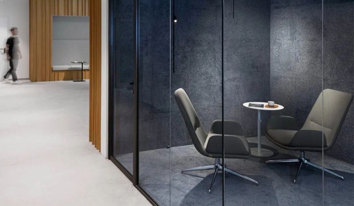
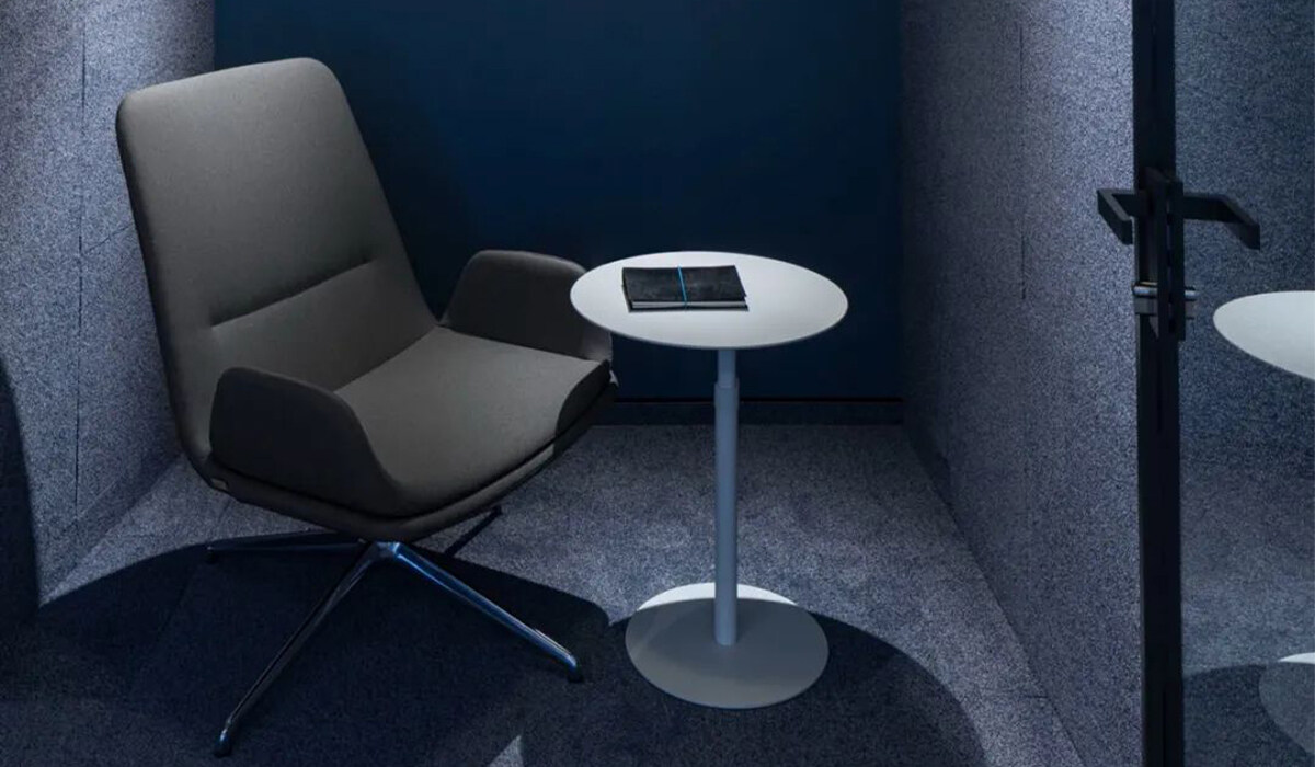
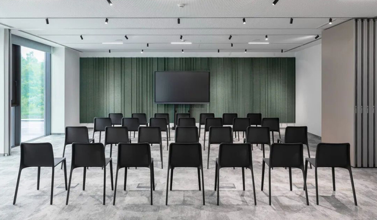
The training hall realizes the interpretation of minimalist style. The dark green background wall continu-
ously creates a high-end atmosphere in the space. At the same time, the different angles of the wall help
to build a better acoustic environment and create an excellent audio-visual experience.
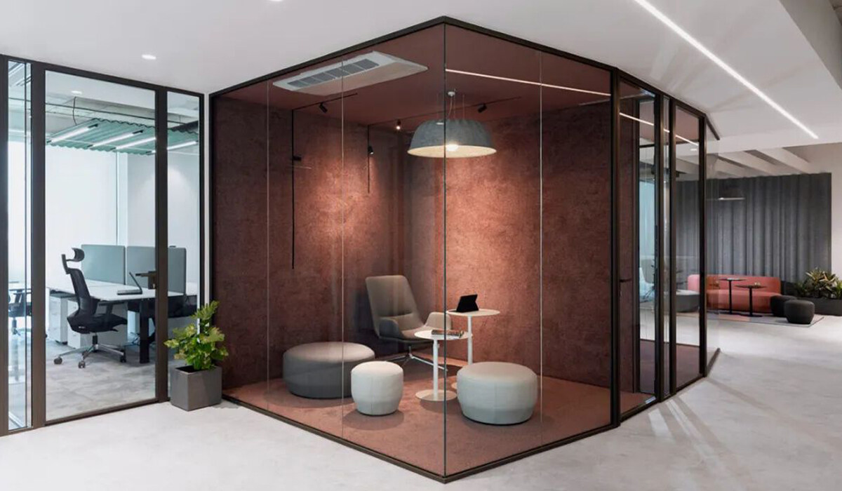
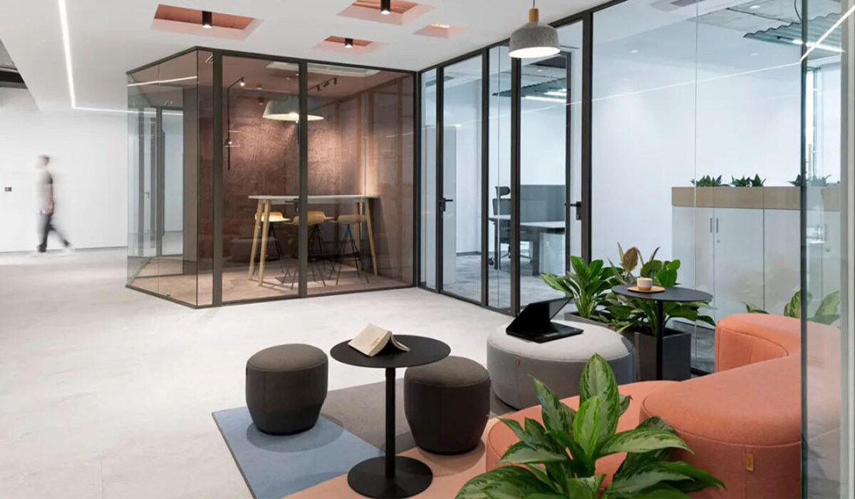
During the design process, many factors of users were considered, such as the professionalism and age
distribution of employees. These humanistic factors are reflected in the display of details. For example,
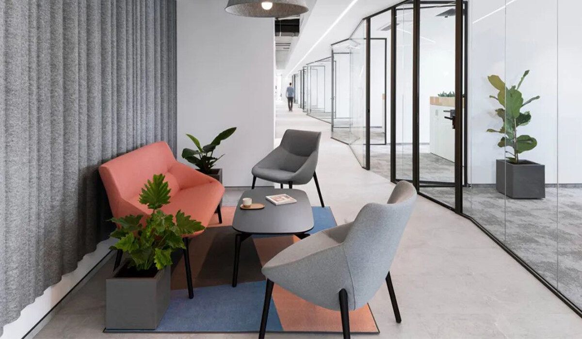
the combination of white walls with soft greens, blues and pinks is designed to create a comfortable and
tranquil space atmosphere, bringing a calm and soothing state to users.
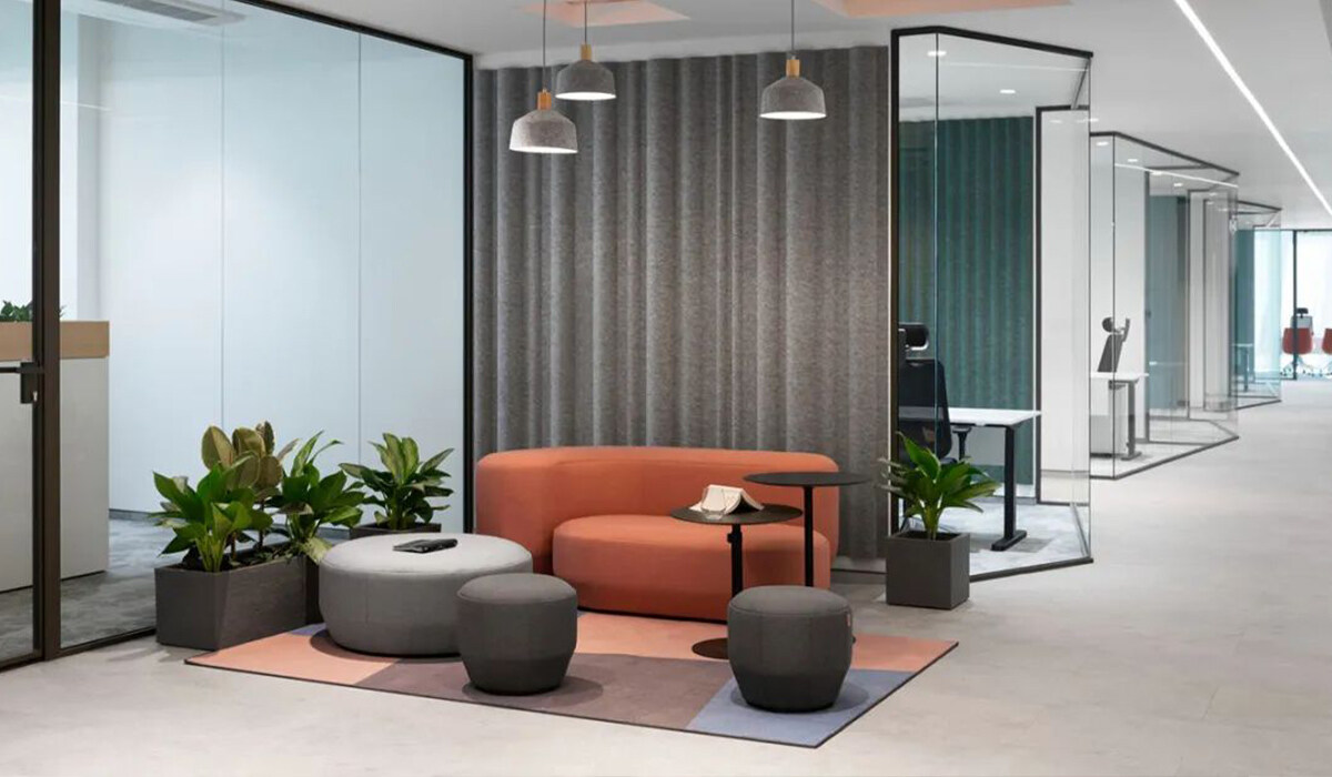
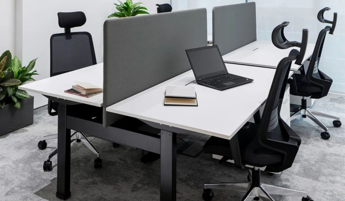
The spatial color matching and its use also follow the overall design concept of the space, emphasizing
the functional gradient and integration between each space. For example, starting with the use of
minimal and subtle colors in work areas, combined with raw materials and a cool minimalist look (which
is part of the company’s DNA), slowly graduated to more colorful and “softer” collaboration areas.
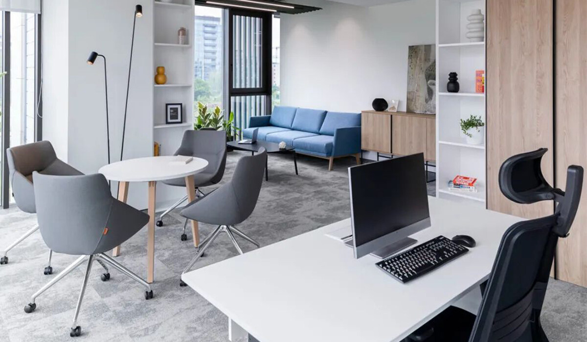
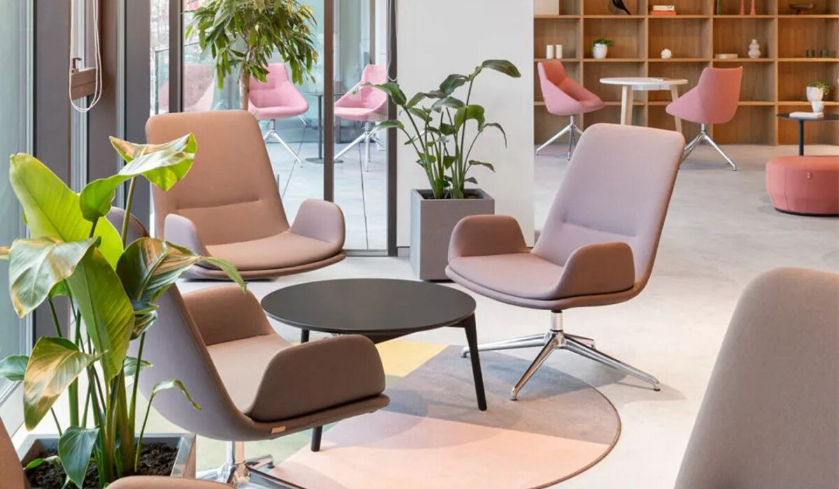
Large-area glass partitions are used in the design to allow natural light to penetrate into the internal
core space, creating a sense of openness and transparency. The white ceiling marks the circulation line
of the passage, while in the closed space, exposed concrete ceiling structure is used more, showing an
original and simple industrial texture.
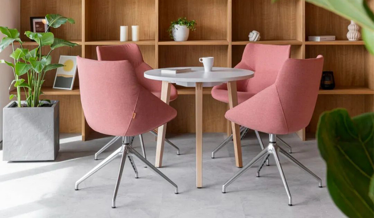
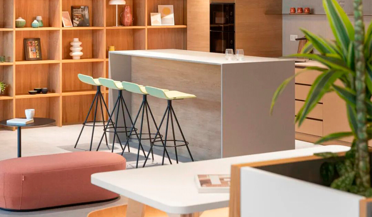
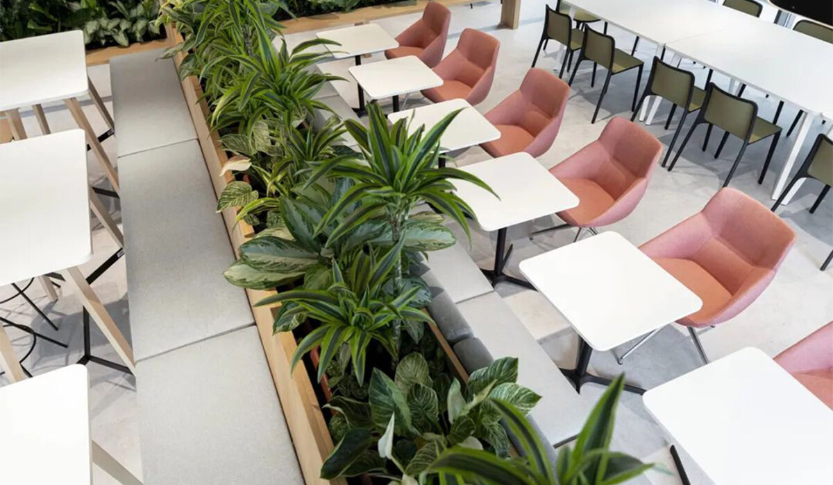
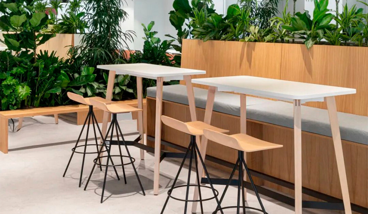
Living in bustling cities and in reinforced concrete buildings, our bodies and minds need natural nourish-
ment and connection. Therefore, a complete lush landscape design was planned throughout the office,
based on the principles of biophilic design methods.
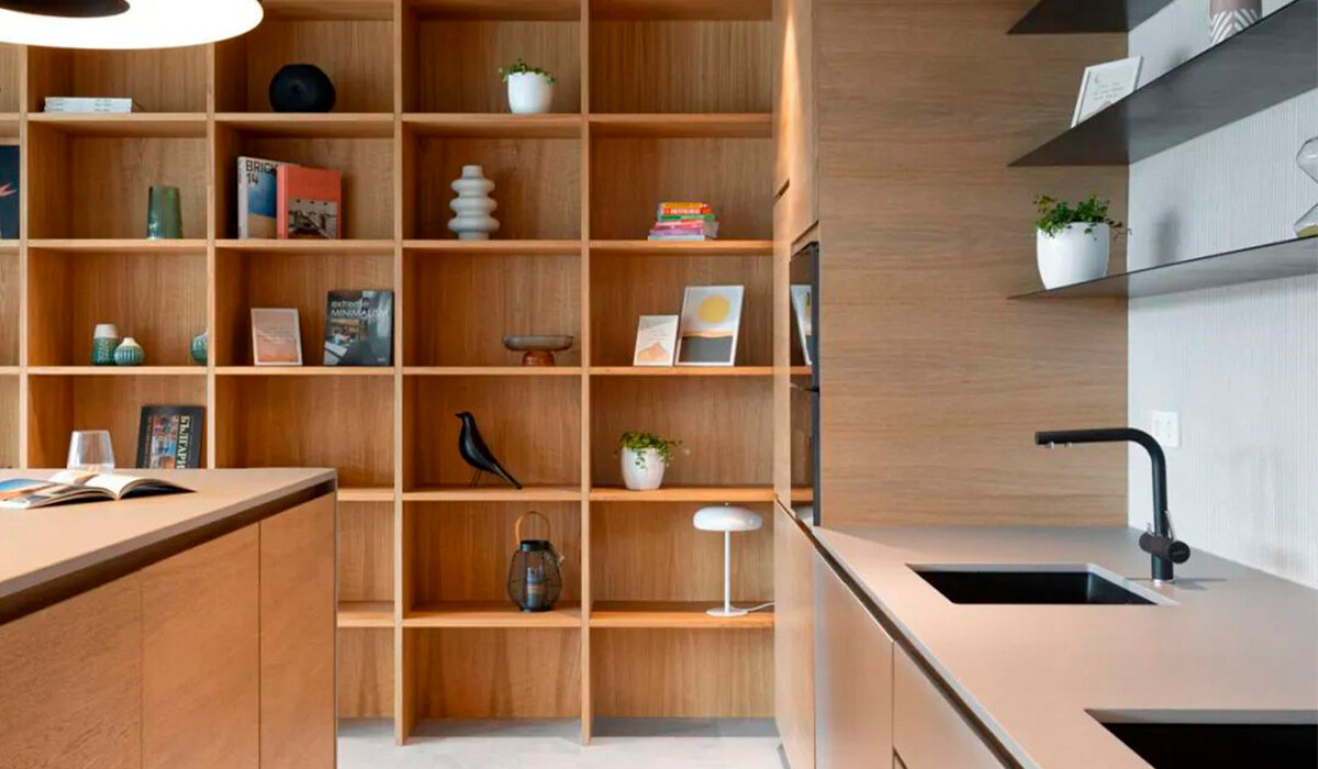
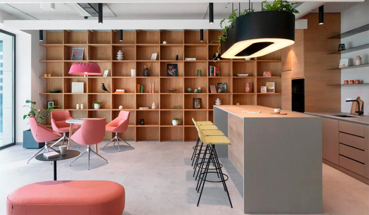
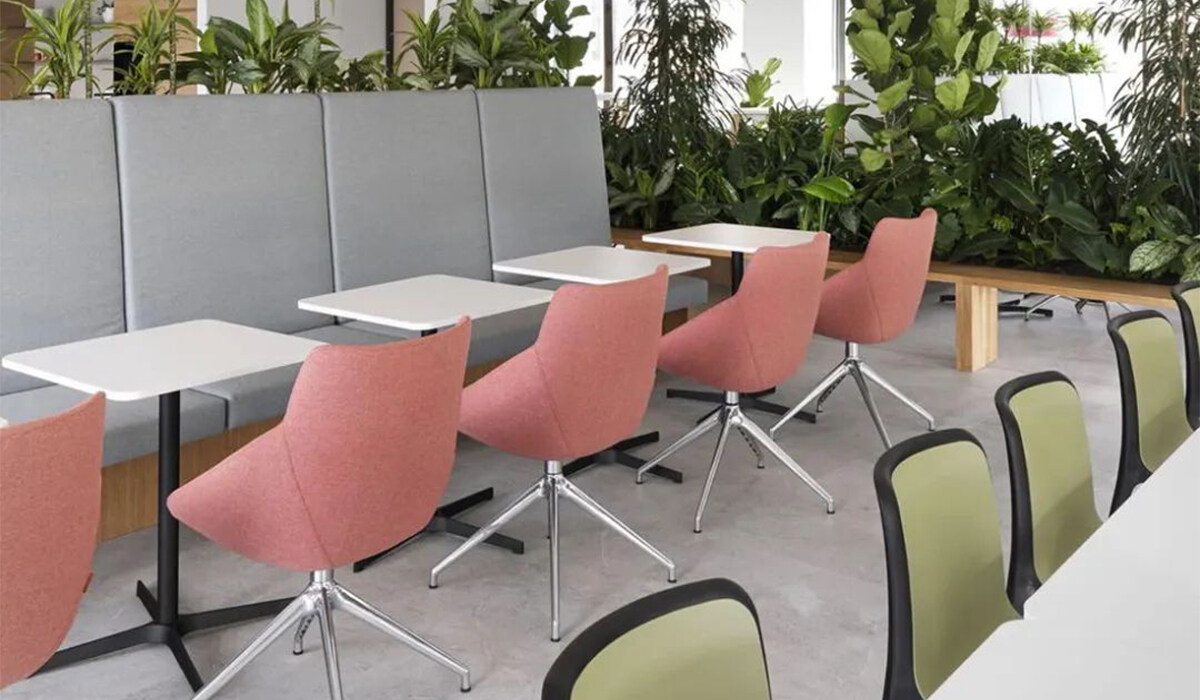
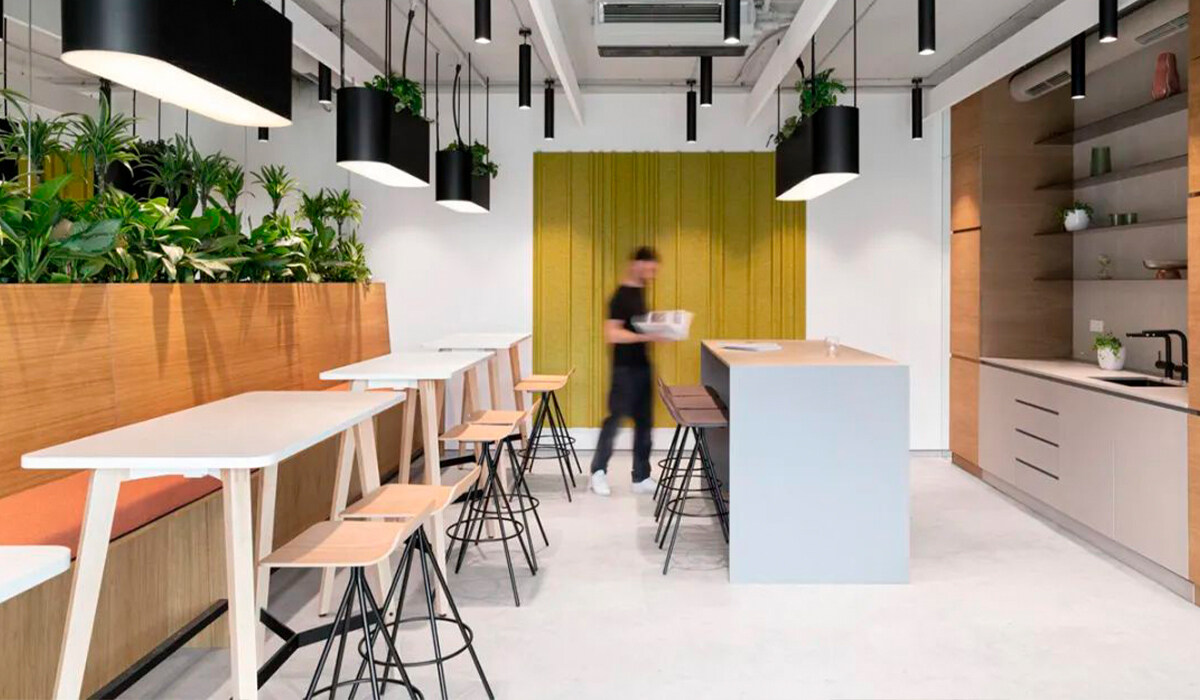
In the work area, green plants adorn the workstations; the collaboration areas are slightly obscured by
larger plants; and the kitchen and social areas are completely obscured by a variety of green plants.
Through these design plans, the indoor microclimate and natural environment can be improved and
enhanced, and ultimately people's productivity, coordination and satisfaction are overall improved.
